Use columns to bring visual balance to your layouts.
For designing beautiful pages with flexible layouts, WordPress offers columns. This intro, for example, uses a two-thirds / one-third column block to hold paragraphs on the left, and a card on the right. On mobile devices and smaller browser windows, the right column stacks below the left.
Use them to display related information or content of parallel importance. It’s important to consider how this content will adjust on smaller windows and design for the mobile experience (see section below on responsive design).
How to use the columns block
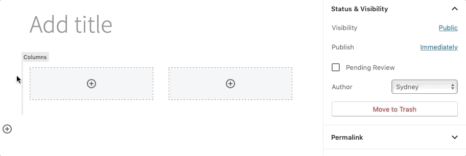
First, add a columns block to the page.
- Select your desired layout from the block’s pre-designed options to get started.
- Don’t see the layout you want? Don’t worry… You can customize the number of columns by first selecting the exterior columns block and then changing the number in the Columns slider in the block settings in the right panel.
- Customize layout by selecting an interior column and changing the Percentage width slider under Column Settings in the block setting in the right panel.
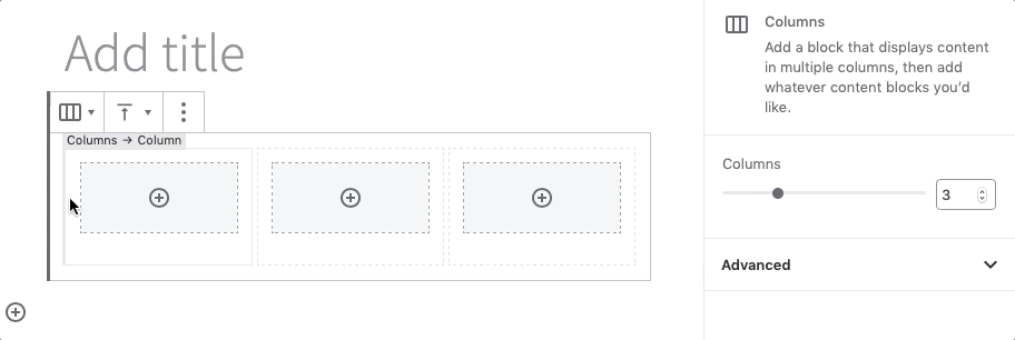
- Click the encircled plus sign to add blocks to your columns, or drag existing blocks into your columns.
Then, add your content.
There are two ways you can add content inside columns:
- Create the content outside of columns. Then select and drag the block(s) into the column block, releasing when you see a blue box around the column.
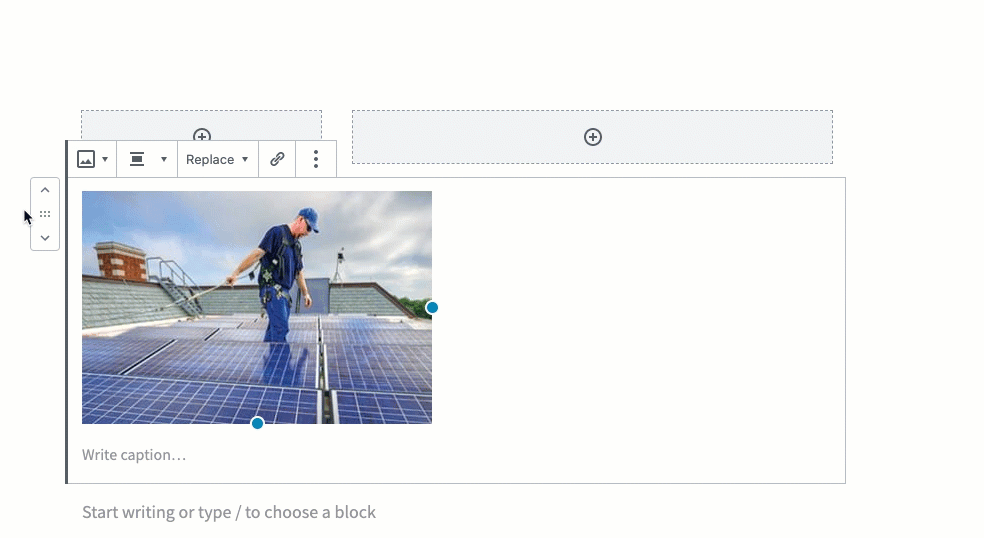
- OR, click the Add Block symbol inside the column to add content.